h3.post-title font-family: 'Bad Script', cursive

Friday, 30 September 2011

Plane and Simple

It's Dad's birthday tomorrow, but we are getting together to celebrate today!

I made him a card with my latest purchase from Stampin' Up - this Plane and Simple Stamps Set.


inside

Papers - My Mind's Eye, 'Life Stories'
Punches - Stampin' Up
Alphabet Stickers- Prima Marketing

Following on from the class I did at retreat, I adapted Zoe's Candle Cake Surprise to go with this card for Dad.

Happy Birthday Dad xxx

Monday, 26 September 2011

Celebrate!

During the weekend retreat with Cardinal Colours, I did a Stampin' Up cards class with Zoe.

Here is what I made in the class:


... and the big surprise was this 2" x 2" x 2" gift box:


when you open it up ...
(flick the switch under the candle before presenting the gift and the flame with flicker)


This was made with scraps from the class kit:


Since the retreat I made these red,white and blue versions with some of the left overs, white Bazzill cardstock and  Scenic Route paper scraps.


Zoe did a special evening make and take for those of us who couldn't fit it in during the day time sessions. The session was to make an owl key ring.
Here is my 'Owl', I made him into a fridge magnet.


Thanks to Zoe and Jill.

Sunday, 25 September 2011

Happy Birthday Zoe!


Here is the card I made for Zoe's birthday earlier this month. It was also made for the Scrapology September card challenge. The Challenge this month was set by Craftwork Cards and the theme was to include bunting.

I used:
Craftwork Cards - Sweet Meadow paper pack
Technique Tuesday - Message in a Banner stamps
I added buttons to the flower centres
The letters for 'ZOE' are American Crafts
Happy Birthday is a Making Memories rub-on.

Pop over to scrapology to see details of the challenge.

Saturday, 24 September 2011

Victorian Screen

Something I have been meaning to post about for some time is this Victorian style screen I made over the late 1970's early 1980's.


I was working at the Bexley hospital for a three months spell during my general training. I got involved in helping a patient while attending occupational therapy. At the time there were many projects involving Victorian découpage being used to decorate furniture. Before I knew it, I was collecting suitable pictures from greetings cards and magazines for the patients to use. When describing découpage here, I mean the decoration of the surface of an object with paper cut-outs, which is then varnished or lacquered, not the three deimensional variety we create for cards today.


After I moved on I decided to make a screen, and purchased three, six foot panels of plywood as a basis for this. However it was a long time before I had enough pictures in my box to cover them. I was always on the look out for suitable images of flowers in magazines, catalogues and greetings cards. Then a big pile of Victorian prints were also collected from the same sourses as well as postcards and small posters. I carefully peeled the back layers away from the thicker card images to make all the picutres of a similar weight. Once I was sure I had enough they were pasted onto the boards with a lot of glue under and over the images to seal them in.


With my Dad's help these panels were framed with pine moulding which we stained with a dark finish varnish. The images were heavily treated with several layers of gloss varnish. Then all three framed panels were joined together with brass hinges.


I was really pleased with the finished screen and wondered what to do with the reverse side of the panels. Eventually I started collecting more pictures so I could treat the back in a similar manner to the front. In the mean time I married and we moved into our current home. I found an interesting strip of newspaper, tightly folded and supporting the shorter leg of a sideboard. When unfolded it was a strip torn from the top of the front page of the coronation issue of The Sun newspaper 1838. With it's gold print, it was badly damaged, but I thought is was ideal to help comlplete the screen.


I continued on with the project and much paper, glue and varnish later, the screen was complete. It has stood in various rooms around the house ever since, and is useful for hiding Christmas shopping!

Friday, 23 September 2011

... And in Colour

Using the same designs I showed you yesterday and the day before here are a selection of cards to show the use of full colour. Of course this involved a lot more Promarkers, but keeping to a minimum, this is what I came up with.

When colouring in a full range of colours, it is still a useful tip to start by colouring the whole area with the palest shade you have. Then build up the shades and finish by using the palest shade to blend the colours. Alternatively you can buy a blending pen which can be used with any colour. You will need a few shades of each colour.

Useful Additions: It is useful to have a fine liner pen in black for detail. A white gel pen is also useful for adding highlights to your coloured image.


All supplied from Jill at Cardinal Colours
Papers - October Afternoon - Seaside Collection
Card Blanks, Card Candi and A4 Digital Smooth White Cardstock - Craftwork Cards
Pens - Promarkers - Pastel yellow, mustard, gold, sandstone, caramel, red, poppy, ruby, pale pink, dusky pink, ivory, powder blue, cornflower, china blue, sky blue, arctic blue and midnight blue. 
Cardstock - Bazzill
Chalk inks - Colorbox
Tuxedo dye based ink pad - Memento
Stamps - by Joanna Sheen's All Our Yesterdays stamps designed by Faye Whittaker
Punches - Stampin' Up
Ribbon - Cardinal Colours

Washroom Teddy FW908 

Lifebuoy FW901 

Bucket and Spade FW912 

Sandcastle FW911 

Dolphin FW907 

Postcard FW909

TFL

Thursday, 22 September 2011

In Black and White

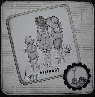
Having taught a class in using Promarkers to create a sepia effect, for the Cardinal Colours Retreat.  Here are the sample cards I made to show a different effect, still using just five pens, but this time in monochromatic, black and white.
The Promarker greys come in convenient sets of five, cool greys, warm greys and ice greys With just a few pens you can colour any image.


Papers - Basic Grey Basics Collection
I used the five ProMarkers pens in the Cool Greys collection.
Stamps - by Joanna Sheen's All Our Yesterdays stamps designed by Faye Whittaker
Charcoal chalk ink - Colorbox
Tuxedo black dye based ink - Memento
Punches - Stampin' Up
Ribbon - Cardinal Colours
All available from Jill at Cardinal Colours

Postcard FW909

Bucket and Spade FW912 

Washroom Teddy FW908 

Sandcastle FW911 

Lifebuoy FW910 

Dolphin FW907 

Sandcastle FW911 

Colour to follow...

Wednesday, 21 September 2011

Oh I Do Like To Be Beside The Seaside

Sepia colouring with Promarkers Class for the Cardinal Colours Retreat.


The cards I made as samples, and included in the class, taught with Linda at Cardinal Colours Retreat last weekend.


Papers - Basic Grey's Basics Collection
Card Blanks, Card Candi and A4 Digital Smooth White Cardstock - Craftwork Cards
Pens - Promarkers in 5 colours - Satin, Pastel Beige, Sandstone, Cinnamon and Caramel.
Cardstock - Bazzill
Chestnut chalk ink - Colorbox
Tuxedo or Rich Cocoa dye based ink pad - Memento
Stamps - by Joanna Sheen's All Our Yesterdays stamps designed by Faye Whittaker
Punches - Stampin' Up
Ribbon - Cardinal Colours
All available from Jill at Cardinal Colours

SEPIA COLOURING TUTORIAL

1. Stamp your image with Memento Tuxedo Black, fade resistant, dye ink onto Smooth White Digital Cardstock. This is a good combination and means the alcohol based ProMarkers will not ‘bleed’ with the paper or water based ink.

2. Start by colouring the entire image using the SATIN marker.


3. Using the PASTEL BEIGE start shading the Shadowy parts to add some definition. For example the folds and shaded areas of the straw hats, shadow where limbs etc. overlap and areas inside or behind items.


4. Now move to SANDSTONE to deepen the shading a little.


5. To deepen shading further take and highlight some  areas with CINNAMON.


6. Use the SATIN pen again and colour the whole image to blend in any sharp lines between colours.


7. Add touches of CARAMEL in darkest parts to add warmth.


If you wish to continue adding darker shading, add in touches of additional darker shades on brown.

I have also achieved similar (but darker) results using the colour range - Ivory, Tan, Cinnamon, Cocoa and Walnut.

Useful Tip – stamping images a while before you want to colour them, helps to prevent the ink running into the colour.

Instructions for making the five cards included in the class

Lifebuoy Stamp - FW910
Cut a piece of light paper 13.5x14cm, and a dark piece 10x8.5cm. Ink the edges of both pieces with brown chalk ink and place on the square scallop edge card as shown. Ink edges of card.


Sandcastle Stamp - FW911
Cut a piece of light paper 11x15cm. Stick over the front of a top notch card. Trim paper to shape of the card and ink the edges with the brown chalk ink. For this card the corners of the image and greeting are rounded – optional.
Mount image to left of the card and the greeting to top right overlapping the image. Mount with 3D foam pads.


Dolphin Stamp - FW907
Cut a piece of dark coloured paper 18x9cm. Ink the edges with brown ink and stick to an oblong scallop edge card. Line the paper up with the top of the card. Ink edges of card. Attach the image to the left of the card.  Add the greeting to the top right overlapping the image.


Washroom Teddy Stamp - FW908
Cut a strip of dark paper 5x15cm and mount onto a piece of Bazzill 5.5x15cm. Ink the edges with brown ink and mount the paper onto the Bazzill. Stick to an elegant Square card about 2.5cm up from the bottom. Trim ends of Bazzill and paper to shape of card with scissors or craft knife. Ink edges of card.
Mount image centrally and add greeting to bottom right of card.


Bucket and Spade Stamp - FW912
For this card stamp and prepare the small bucket and spade image in addition to the main image and greeting.
Cut some light paper 14.5x14.5cm, ink edges with brown ink. Mount onto a square card. Cut a piece of dark paper 14.5x5cm, and trim with scalloped edge punch and ink the edges. Add this to the top of the card like a canopy. Mount the Large image centrally onto the card tucking the top under the canopy. Add the small image to the bottom right and the greeting to the bottom left.


There were five cards in the class, but six stamps in the series, so I made this easel card using a cream coloured card blank and added some Card Candi.

Postcard Stamp - FW909

Thank you to all who attended the class.

Black and white and colour versions to follow.

TFL

Some great feedback from Sue (Mini Owner on her blog) and here are her cards.
Thanks Sue - so pleased you enjoyed the class.


If anyone else wants me to share their cards here, please comment with a link or send me an email and I will add them.