h3.post-title font-family: 'Bad Script', cursive

Sunday, 31 May 2015

Counting Sheep (1)

Catherine and I don't get so much time to spend together while she is on tour, so when she had the chance to commute to Richmond for the week, we booked to spend the day together on my day off - Friday (29th). She didn't need to be at Waterloo Station until 17.30 to catch the train for the evening performance of 'And then There Were None'. It seemed a good Idea to spend the day in London as this would give us more time together.  Warning - this post is photo heavy!!


We set off after the rush hour in glorious sunshine, and Catherine down loaded the APP for the 'Shaun in the City' official trail in London. We realised it only had a few more days to run, so we would look up as many as we could in the time we had.

As there are four different trails and we had no particular preference as to where we should start we jumped on the first train to London which happened to be the Cannon Street train. As there are major works at London Bridge we decided if we could alight there we would otherwise we would go on to Cannon Street. We would start with the nearest Shaun to the station. As the train approached London the clouds gathered!

Rainbow
We were able to start our adventure at London Bridge once we battled through the crowds on the platforms. We were best placed to start with BITZER'S 5km TRAIL, No. 4, which should take about 2 hours and 20 minutes. The first of the Shauns on this trail was inside the Joiner Street entrance to The View From the Shard building. This Shaun was called 'RAINBOW' (32), designed by Tatty Devine. Rainbow is sponsored by The View from the Shard.

Being a rainbow deisgn made this one of Catherine's favourites. Pleased to be inside for a bit as it was now starting to rain. Here we picked up a map for the trails which proved to be very helpful. We added the code to the APP and set off again.


Out into the wet and along The Thames to find 'MITTENS' (33), designed by Simon Tofield at More London.  'LENNY' (34), by Vivi Cuevas (sponsored by Bond Dickinson), and 'PETAL' (35), by Emily Ketteringham (sponsored by Norton Rose Fulbright), were also at More London.
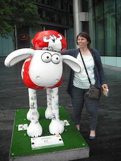
Mittens
Lenny
Amazing views of London Landmarks across The Thames from here.
Petal and Petal!
 As if we were not wet enough water was coming up out of the ground as well as the sky!!


'GLOBETROTTER' (36) was next on our list located near the South Tower of Tower Bridge - we found ourselves on the wrong side of the road and a little backtracking was needed to seek him out. Globetrotter (with stars in his eyes) was designed by Sarah Matthews. Sponsored by Villa Plus.


We continued on over the bridge and found 'YEOMAN OF THE BAAARD' (37), by Vivi Cuevas, situated at Tower Pier. The sponsor is Yankee Candle.

Yeoman of the Baaard

By now the rain was coming down hard so we hid in a coffee shop with a view of The Tower of London and had an early lunch. Once the rain eased off we ventured out again. At the Tower we found SHAUN-XIAO (38), designed by Stephen Taylor and sponsored by The Royal Mint

Shaun-Xiao

'LIBERTY BELL' (39), was hiding at Fenchurch Street Station, This Shaun was designed and sponsored by the Shaun in the City Team.

Liberty Bell
Off to find the Lloyd's Building next, and here we discovered 'KANZASHI' (40), in Lime Street. Kanzashi was designed by Kate Strudwick and sponsored by Canopius.

Kanzashi
 'SHANGHAI SHAUN' (41), was not far away at Leadenhall Market, designed by Ashley Boddy and sponsored by Leadenhall Market. This place looks worth another visit, great place to eat and shop.

Shanghai Shaun
The app was great fun as you can mark off the Shauns as you find them using the codes and it told you when you were near each one. It helped locate the next Shaun on the trail, but often the GPS was not working. By now the APP was seriously draining the power from the mobile and we had purchased it for both our mobiles, one Android and the other an iPhone, We did take it in turns for a while to save power. We decided to rely on the map for a bit at this point.

So it was not quite so easy to locate 'ROBO-SHAUN' (42), but we did it! He was at The Royal Exchange. Designed by Tim Sutcliffe and sponsored by Haseltine Lake.

Robo-Shaun
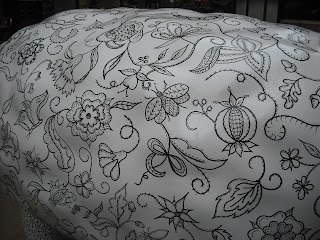
We had a little help for the next one as we were very close, and hesitated outside the Devonshire Square building when the concierge took pity on us, asked if we were looking for Shaun and told us we had the right building and to go inside! 'RUFFLES' (43) was inside this very impressive place. Ruffles was designed by Deborah Wilding based on Elizabethan Blackwork embroidery designs. The Shaun was sponsored by Devonshire Square. I think this was one of my favourite designs.

Ruffles
Detail - Ruffles
Liverpool Street Station was our next destination and here just in front of Platform 1 we found  'THE PEARLY KING' (44), designed by Ruth Broadway and sponsored by I. J. McGill Transport.

The Pearly King
Then a strange thing happened as we set off the find the next and last sheep on the Bitzer's trail we found a sheep that had strayed from Covent Garden and was hiding in Broadgate Circle. This was 'CANDY BAA' (15) Timmy's Trail. This was designed by Emily Golden and sponsored by Green's Cake Mixes.

Candy Baa
I guess if we could have used the APP we would have found this out, we put the phone back on and from the APP discovered we missed 'ANOTHER ON RIDES THE BUS' (16) as that had also been moved away from Covent Garden and was now at Broadgate Tower. This Shaun was designed by Susan Donna Webber and sponsored by Pasta King (UK) Ltd

We weaved our way round to Finsbury Avenue Square to find 'MR. SHAUN' (45), designed by Mr. Men and Little Miss, and sponsored by Broadgate City of London


Another interesting piece of art at this location is 'The Rush Hour' by George Segal.


This was the end of Bitzer's Trail, the longest of the four trails, from the Shard to the City's business district. Back with more of the trail another day...

thanks for looking

Lynn x

Sunday, 24 May 2015

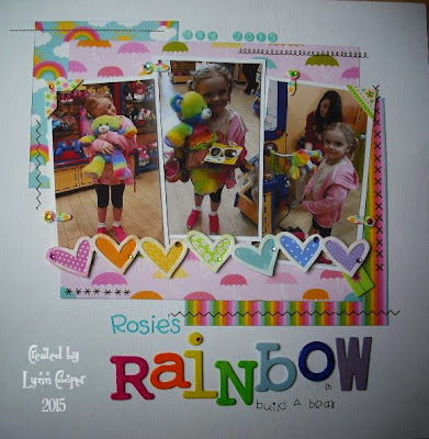
Rosie's Rainbow

I have a few hours to myself this afternoon and had just seen these photos of my cousin's daughter Rosie, so decided to make a layout with some Doodlebug Designs Inc. products  ideal for rainbows.


Rosie went to Build a Bear yesterday and helped make her own bear - 'Rainbow'.

For the layout I used:
Cardstock - Bazzill
Patterned papers - Doodlebug Designs Inc. - Springtime Collection - Bright and sunny & April showers
Scraps of patterned papers - Various collections by Doodlebug Designs
Gems - Doodlebug Designs Inc. - Mini Jewels 
Chipboard letters - Woodware Chippies - die cut chipboard alphabet
Cardstock heart trim - Bazzill Just The Edge strips
Acrylic Paints & Glossy Accents for painting the chipboard letters
Rub-ons - Stitches and letters  by Doodlebyg Designs Inc.
Teeny Type letter stickers- Doodlebug Designs Inc. - Poolside
Chalk Inks - Colorbox

Thanks for looking
Lynn x

Friday, 22 May 2015

Who Needs Toys?

Catherine had the whole saucepan cupboard out to play one afternoon, and Andrew came along to join in. Looks like they are telling me they want poached eggs for tea! Photo taken in May 1993.


This was another Page Maps University sketch from Oct 2013

Papers & element stickers - Cup cake - Basic Grey
Punch - Martha Stewart
Stickles, Liquid Pearls, Distress Ink
Machine stitching with red thread
Twine and buttons
Dew drops, gems and pearls
Letter stickers - American Crafts Thickers

Thanks for looking
Lynn x

Tuesday, 19 May 2015

Tea Chest

A cup of tea anyone?

I purchased box of drawers in a sale at Papermaze a few months ago and have just got around to making it into a tea chest to store all the different teas I have acquired.


The papers I selected had a tea theme, but they are also floral so will go well on my dresser with my china. The papers are from Graphic 45 'Botanical Tea Collection'.


Each drawer was covered with a different piece of patterned paper. Thin I did some fussy cutting to add more detail to each drawer and inked all the edges.


The top was treated with several pieces to make a collage as it was slightly longer than 12". Again I added cut out details.


Both ends were treated in the same was with the same sheet of paper.


The was the back is arranged made it a perfect size for a sheet of 12" paper from side to side, I only had to trim the bottom of the page off. 


I added the Kaisercraft metal label pulls in brass. with tiny labels I printed myself on the computer. there is a selection of templates for this in the pack with the pulls. These can easily be changed if I decide to use the box to store something else.


The box itself was painted with acrylic paint, then distressed with inks.
Pleased with the finished result and the box is stocked up and ready to use. My grocery cupboard is now much tidier too!

Thanks for looking
Lynn x

Monday, 18 May 2015

Letter Holder - Beyond The Page Project

Working at organisation within the study / craft room. This was one of the 'Beyond the Page' projects from last summer's Merly Impressions Retreat. I finished it a few weeks ago and have only just found time to tell you about it.


This project was designed by Chrissy Tingey using Kaisercraft Art of Life Collection. I thought it would be great for storing scrapbook materials if not used for letter writing bits and pieces.


The kit included:
BTP Letter Holder made of MDF Kaisercraft
Patterned papers - Kaisercraft Art of Life collection
Wooden flourishes and Silver drawer knobs - Kaisercraft
Edges Stamp Set - Kaisercraft


I also used Glossy Accents. black acrylic paint, metal label holder and brads and wood glue.


I swapped the fussy cutting of flowers for a metal label holder, and printed the lettering to go inside in my computer. I also added a metal key to match.


It was good fun to make this box up, the drawers are a little tricky to get them to look neat but very effective when complete.

Thanks for looking
Lynn x

Sunday, 17 May 2015

Me and My Girl


I have been sorting out and scanning some old photos and found this one of Catherine and me back in 1993. A quick simple layout using 2013 Page Map University sketch.

I used:

Page Map
Cricut - Storybook Cartridge & Tags, Bags, Boxes & More
Letter stickers - American Craft foam Thickers
Cardstock - Bazzill
Punches - Woodware
Element Stickers and papers - Basic Grey - Picadilly Collection
Buttons, gems and Twine
Sizzlets - Rosette die
Distress inks


Thanks for looking
Lynn x


Saturday, 9 May 2015

Together We Are Family

I really like these chalk board effect papers by My Mind's Eye - Chalk Studio II collection. Great colours against the black and white.


The photograph was taken by my father when the triplets were about 7 months old. We dressed them up in their Christening clothes a few days before the event for  photo shoot. Rare to have a photo of all five of us together:


I used:
Inspiration from Wendy Partridge on Srapbook.com
Patterend papers and stickers - My Mind's Eye - Chalk Studio II collection
Seam binding ribbon
Doily
Black Distress Ink
Buttons
DMC Thread
White cardstock - Bazzill
Liquid Pearls
Decorative Pins

Thanks for looking
Lynn x

Friday, 8 May 2015

Dublin 2014

We had a 12 hour crop at Cardinal Colours last weekend with a great set of crafty girls. I made up some kits to work on during the day and I used a Page Map as a source of inspiration for this one.


The photos were taken by Alan of Catherine and me, when we first arrived in Dublin last summer. We were exploring the city along by the River Liffey - such a lovely day.

I used:
Patterned papers, alphabet & element stickers - Basic Grey - What's Up collection,
Die - sizzix for the photo wheel
Letter stickers - American Craft - Thickers
Punches - Stampin' Up
Other - wooden heart element, metal word bars, glittery plastic glasses from an old key-ring, button, twine
Sewing machine and thread
Ink - Dristess ink

Thanks for looking
Lynn x


Sunday, 3 May 2015

Busy Buzzing Bees - A class with JOFY

On 26th May my plans changed unexpectedly and so I was able to attend a class at the Craft Barn by Jo Firth-Young, (JOFY) designer for PaperArtsy.
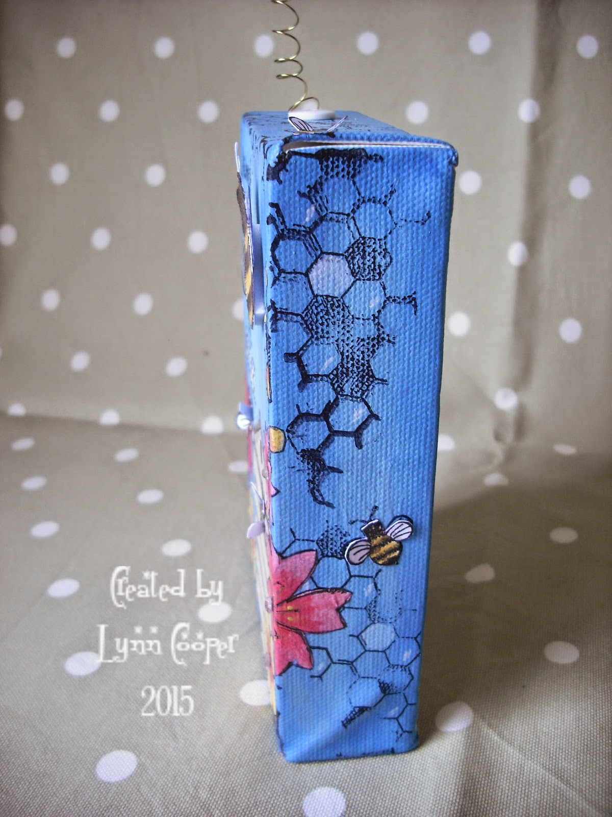
The class was to make this fun box canvas with two of Jo's stamps sets.


We were given a small box canvas which we painted with our choice of colours from the Fresco Finish Chalk Acrylic paint range. Then we stamped the message and some honeycomb patterns directly onto the canvas, some of the patterns overlap the deep sides of the canvas. We painted in the hollow outlines for two of the words with white paint.
A printed page from an old book was supplied and this we painted with a wash of white paint, stamped the hive, then pained in shadows. This was cut out and stuck into position on the canvas.


The flowers were stamped onto tissue paper and painted, then cut out! Quite tricky cutting out these as they were on very narrow branches! It went very quiet while we all concentrated hard at this point.


We stamped large and small bees onto card and painted in the details, before cutting them out. We cut the wings off the large Bees! - but added new ones made by stamping on acetate. 


Bees and flowers were added to the canvas, again they were wrapped around the sides.

The wings of the tiny bees were folded up so they appear to be in flight.

A tiny hole was drilled in the top of the canvas so one large bee could be added by means of a coil of fine wire - from where he could hover over the canvas. The hole was tidied up with a tiny button.
And one lovely bee buzzing around on a wire from the top.


I finished off with a marker to go over any of the stamped lines which had acquired a little paint, and the gems were added to the flowers.


This was a great class and I thank Jo for teaching it and sharing lots of hints and tips along the way. 

It was also lovely to meet Dame Judi Dench in the Farm shop next door during our lunch break. 

I will certainly use this technique again and I have now acquired some of Jo's stamps to play with at home. 

Thanks for looking
Lynn x