h3.post-title font-family: 'Bad Script', cursive

Saturday, 25 August 2012

Jelly Time

I purchased a kit from the July Papermaze Crop, as I didn't have all the tools from the class, I put it together a little differently.


The papers in the kit are Crate Paper - Pretty Party - Tag Cuts, Stitch and Streamers.
Bazzill - Topaz
Pink Cotton Candy Twine
Pink dew drops
I didn't use the the Tando Creative Butterfly as I didn't have the means to emboss it, but I will save it for another page.

I used several Martha Stewart punches - round the page, deep edge, border and butterfly.
I added Cosmic Mist instead of paint

I added some flat backed pearls, ribbon, American Carfts Thickers for 'Time' and I used the Cuttlebug to cut Jelly from paper.

The photograph is of me at the age of two years in our back garden at a gathering to celebrate my sister's Christening. I'm sure I don't remember the occasion and the things from that day, but I do remember several things in this picture from my childhood.

The journalling reads:
I remember the:
Green glass sundae dishes
Silver spoons Mum's jellies
Blue frilly party dress
Hair bows.

Close up of butterflies:

Here is Vanessa's original page.

Thanks for looking.
Lynn x

Thursday, 23 August 2012

C.S.I. Case #33 - Shipwrecked

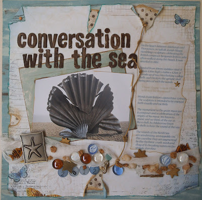
I was chuffed to make the 'On the watch list' last week for my 'Conversation with the sea layout.

Here is my third attempt at the C.S.I. (Colour Stories, Inspiration) challenge
I'm still away from home but this encouraged me to make good use of the items I have here with me. These challenges are great for getting me to use my stash. I was keen to try out this nautical colour combination for challenge #33.


My page records the children on holiday on the Isles of Scilly back in 2000. We we staying on the main Island of St. Mary's but took regular boat trips to the smaller islands. On this particular day we travelled to Tresco. It's dry in this photo, but we spent most of the day exploring the tropical gardens in wet weather gear as it rained nearly all day. In this photo the kids are enjoying the Valhalla museum. (see journalling below).

Here is the inspirational case file #33


THE EVIDENCE FROM WHICH YOU NEED TO CHOOSE AT LEAST 2 ELEMENTS
I have highlighted in red the elements I chose to include, and what I used:

wood/woodgrain - My Mind's Eye Miss Caroline - Fiddlesticks 'Love' Woodgrain paper
liquid medium - Acrylic paint 
clouds
something sand-like (e.g., glitter, sand, embossing powder, etc.)
something that shines (inspired by the light in a lighthouse)
Create shadows
white background
bricks
something transparent - watch glasses (over two of the images from the coordinates sheets), glass nuggets and Hambly Screen print Urban Chic Frame overlay.
triangles
metal nautical elements - Making Memories lighthouse metal plate

I also used:
Orange net bag
Basic Grey - pb&j - raspberry jam paper
Basic Grey - Marrakech - blue nights
Twine
Cricut to cut the big frame shape
Li'l Davis Designs Foam Stamps 'Tumbleweed' for the title.


THE TESTIMONY FROM WHICH YOU NEED TO CHOOSE AT LEAST 1 ELEMENT
Again I have highlighted in red the elements I have included.
Document a landmark you've visited.
Write three facts (inspired by the red planks)
Use journaling strips (inspired by the planks)
Go to the Lighthouse Young Writers Online blog to be inspired, and see where it leads you.
Inspiration Words: light, safe, guide-- use these as inspiration for your journaling, not just as a title

My journalling reads ...

"
Andrew, Catherine and Emily on holiday on the Isles of Scilly. We took you on a boattrip to Tresco to visit the  Abbey Gardens. Here you were fascinated by the unique Valhalla collection of some 30 figureheads, as well as name-oards and other decorative ships' carvings dating from middle of the 19th century."


... and is printed onto a postcard from the Coordinates sheets.


 THE COLOURS  - YOU NEED TO USE ALL 5 

Maritime Red - brick red - taken from the walk way
Nautical Gray -
 charcoal, taken from the lighter part of the roof of the lighthouse
Salty Sand -
 sand beige, taken from the sand
Beacon Blue
 - pale sky blue, taken from the lightest part of the sky
Deep Blue Sea -
 bismarck/cadet blue, taken from the water


THE COORDINATES ARE ALSO AVAILABLE TO DOWNLOAD IF YOU WANT THEM


The deadline for completing Case File No. 33
is Sunday, August 26, 11:59 p.m. EST.

I have had great fun scrapping this layout and look forward to doing the next challenge.

Thanks for looking.

Wednesday, 22 August 2012

Silk and Symfonie!

The other day I was in Twist, a beautiful knitting shop in Woodbridge and I treated myself to a 25g ball of this Rowan Kidsilk Haze to make a one ball lacy shawlette/scarf. They had samples of them made up in many different and gorgeous colours.


I started knitting with it to find my usual needles too heavy and long, so popped back in today to buy some shorter needles. The lady in the shop recommended Symfonie needles, made from birch wood and explained that all the samples had been knitted on these.  She warned me I wouldn't want to knit with anything else after trying these! I will let you know. Anyone else tried them?


You can check them out at www.knitpro.eu


Looking forward to trying them out later.


Tuesday, 21 August 2012

Godmother

Here is my version of this month's crop kit for Papermaze. It was designed by Louise Collins. I love the colours and designs of these Carta Bella - Paris Girl papers. Great to make a shaped layout too.


 I flipped the page as I like my photo subjects to be looking into the page rather than off the edge!
This photo is one I found recently of my sister Sylvia, at her Christening with her Godmother Sylvia. I have already scrapped some of the beautiful photographs that my father took on that day, but recently found a few more which I scanned. This one is so 1960's. My title was created with a rub-on from Kaiser Craft, but I altered it to read Godmother rather than mother with another rub-on from the same sheet. I added some Making Memories rub-on numbers for the date.

This layout used Bazzill, Carta Bella Paris Girl Papers - French Labels and Paris Borders, black lace, Queen & Co. grey flat backed pearls, Smash tape - black dots and pink chalkboard glimmer mist.

Here is Lou's pretty original layout.

Great kit, really enjoyed making this up.
Thanks for looking

Friday, 17 August 2012

C.S.I. #32

Here is my second attempt at the C.S.I. (Colour Stories, Inspiration) challenge
I'm away from home still but wanted to have a go at this cool colour combination challenge #32.
My page records a cycle ride Alan and I enjoyed, despite the cold wind, from Thropeness to Aldeburgh earlier this year. We stopped to take a closer look at the Scallop Shell sculpture on the beach.

Here is my layout:


Here is the inspirational case file #32


THE EVIDENCE FROM WHICH YOU NEED TO CHOOSE AT LEAST 2 ELEMENTS
I have highlighted in blue the elements I chose to include, and what I used:
stars - gold starfish clasp holding vellum & Making Memories starfish plaque
something translucent - glass pebbles
wet medium - Acrylic Paint and Chalk Inks
something grainy (e.g., glitter, sand, embossing powder, etc.)
textured paper
vellum - Jorunalling printed onto Vellum
dots (inspired by the pattern on the starfish) - Wild Asparagus - Me and My Brother (dots / brown)
round or somehow soften the edges of your photos or papers - torn and inked edges of papers
mesh, burlap, gauze, or similar element - gauze bandage

I also used:
Patterned papers - Bo Bunny - Country Garden Weathered,
Wild Asparagus Me and My Brother Frame
Some Doodlebug Designs Inc. number buttons which are translucent
Various brads
American Crafts Thickers for the title
1 Sheet Bazzill in an Aqua shade
IKEA Onska Yarn
Wooden stars
Cork chippings
Shells
Skeleton fish beads
Seahorse charm
Crackle medium

THE TESTIMONY FROM WHICH YOU NEED TO CHOOSE AT LEAST 1 ELEMENT
Again I have highlighted in blue the elements I have included. 

Document a beach trip (or other vacation if you've never been to the sea).
Journal about something you collect.
Create a translucent pocket or envelope for your journaling - Journalling on Vellum
Document a transformation (inspired by the broken glass that turns into a beautiful treasure).
Use the first stanza of William Blake's poem as a jumping off point for your journaling:

To see a world in a grain of sand
And a heaven in a wild flower
Hold infinity in the palm of your hand
And eternity in an hour. 
Words from Britten's Opera instead
Inspiration Words: calm, seek, change -- use these as inspiration for your journaling, not just as a title

My journalling reads:

 'Conversation with the Sea'
"On the beach between Aldeburgh and
Thorpeness, in Suffolk stands Maggi
Hambling's sculpture celebrating the
British composer Benjamin Britten, who
often walked along this beach. It was
unveiled in 2003

Created from 10mm stainless steel, it
stands 4.10m high x 4.60m x 4.25m. It
is made up of two interlocking scallop
shells, each broken, the upright shell
being pierced with the words:

     "I hear those voices that
     will not be drowned"


Words from Britten's opera Peter Grimes.
 The sculpture is intended to be enjoyed
both visually and tactiley.

The monument to the great musician
& composer and a celebration of the
origins of his music. We listen to
 music and we think of the ear as
like a shell. As children we listen
to shells to hear the sound of the sea.
The sounds of the North Sea
are unrelenting, unstoppable. On
this coastline they are augmented
by the rhythmic crash, wash and
drag of its breaking waves on the
shingle shoreline."


THE COLOURS  - YOU NEED TO USE ALL 5
Sunbleached - white, from the starfish
Beach Grass
 - light brown, from the darker parts of the beach grass
Sand Dune
 - light kraft, from the lighter parts of the beach grass
Wave Washed
 - teal, taken from the side of the oblong piece of sea glass near the front of the image robot
Sea Glass
 - light aqua, taken from the bottom part of the topmost piece of sea glass


THE COORDINATES ARE ALSO AVAILABLE TO DOWNLOAD IF YOU WANT THEM


The deadline for completing Case File No. 32
is Sunday, August 19, 11:59 p.m. EST.

I have had great fun scrapping this layout and look forward to doing the next challenge when I can get a few more items of stash together.

Thanks for looking.


Up-date on 22/08/12 I have just visited the C.S.I. site and was amazed to see I made the 'On The Watch List' - described as ...and just because there were too many fantastic layouts in the gallery, here are a few more that caught our eye. Not 'Star Witness' or 'Most Wanted' but its great to be acknowledged.

Thursday, 16 August 2012

Scrap 365 - Disney in Winter


I loved this month's sketch and wanted to play along with the August Scrap365 Online sketch challenge.

I used some photos of my daughter Catherine in Disneyland in the winter of 2008 during a school trip to Paris.


The August sketch is from a layout by Tomoko Takahashi.


This is what I used:
Patterned papers: Bo Bunny - Country Garden - Garden Dot (reverse side), Charm (stripe side)
My Little Shoe Box - Robots Un-plugged - Metal Stars (die cut sheet)
Sassafras Sunshine Lollipop Cardstock Sticker sheet
3 sheets Bazzill Basics in pink, gery and black
American Crafts Glitter Letter Stickers Rockabye and Roller Rink
Rub-On letters - Doodlebug Design Inc. - All Mixed Up
Doily, Twine, Eyelets, Flat-backed pearls
Stampin' Up Build a Banner Punch
Colorbox Chalk Ink - Blackbird
Making Memories - Button brads

Thanks for the challenge 365.
Thanks for looking.

Lynn x


Wednesday, 15 August 2012

Double Trouble

For the August card challenge on Scrapology this month we have been sponsored by Bev Rochester of Lili of the Valley.

We challenge you to make a card using any make of image with two characters (pairs, couples, two by two etc.)

Pop over to the Scrapology site to see what the design team have come up with using LOTV images.


I used:
Lili of the Valley stamp for image and greeting
Cricut and Accent Essentials cartridge
Magnolia scrapbooking papers
Card blank from Papermania
Flat backed pearls and hearts
Liquid pearls
Punches by Stampin' Up and Woodware
Organza ribbon
ribbon roses
Chalk inks Colorbox

Please pop over to Scrapology to see the details of this challenge and the work of the design team.
The prize is a £10 voucher to spend with LOTV.

Sunday, 12 August 2012

C.S.I. #31 - Down By The Sea

I recently came across the C.S.I. (Colour Stories, Inspiration) challenge blog and I love the concept and the clever colour combinations. I wanted to have a go but haven't had much time, however I have a few days away at the moment so decided to give challenge 31 a try last night (with 24 hours to go to the closing date and time and very limited supplies). It did make me use papers from different collections and manufacturers together, which I must admit I don't often do.


My photo shows me on the beach with my Nan and Suzie the corgi in about 1962, and is scanned from a colour slide. I think it is Woolacombe in Cornwall but will check when I go home. Someone (Mum or Dad I expect had built some sand castles and written my mane in shells. 

My journalling reads:

Memories of childhood seaside holidays
* My Nan always came on holiday with us
* Suzie the dog on the beach
*The multi-coloured rubber bucket
* Someone writing my name in shells
* Building sandcastles
* That skirt with bunnies on!

Here is the inspirational case file #31


THE EVIDENCE FROM WHICH YOU NEED TO CHOOSE AT LEAST 2 ELEMENTS
I have highlighted in pink the elements I chose to include, and what I used:
wood/woodgrain

liquid medium (paint, mist, etc.) - Cosmic Shimmer Mists in Blue Lime and Mallow Blush and Colorbox Chalk Ink in Deep Lagoon.

distressing, 
Use repetition of an element.
umbrella accents
furniture accents
circles (inspired by the stools) - Large ring circle cut on the Cricut with George & Basic Shapes cartridge, EK Success deep border punch - scalloped border with circles, Echo Park dots and stripes paper in Peony.
Use a solid background (inspired by the cloudless sky) - White Bazzill

Include parallel lines (inspired by the pier railing) - Echo Park Dots and Stripes papers in Peony and Robin's Egg

I also used:
Magnolia Ink - Butterfly Dreams - Butterfly Kisses paper
Pink Paislee - Spring Jubilee - Celebration paper
Bazzil in a colour unknown to match the Caribbean Sea element
Martha Stewart Frond Punch
Cricut for Tags using same cart.
Star buttons
Flat backed Pearls
Lace daisies
Blossoms for a child's hairband
Pleased ribbon from Webster's Pages
Ribbon
American Crafts Thickers for title - Lovely foam rubber stickers by Any Tangerine

THE TESTIMONY FROM WHICH YOU NEED TO CHOOSE AT LEAST 1 ELEMENT
Again I have highlighted in pink the elements I have included. 
Document a vacation.
Write your journaling in the form of an itinerary (doesn't have to actually be about a vacation).
This photo is called "Key West Umbrellas." Begin your journaling with, "The key to ___ is..."
Use repetition in your journaling.
Add something to the top of your journaling spot, sort of like an umbrella or canopy.
Inspiration Words: colour, bright, vacation -- use these as inspiration for your journaling, not just as a title.
THE COLOURS  - YOU NEED TO USE ALL 5


Island Sky - cyan blue, taken from the second table
Tropical Sunshine - bright yellow, taken from the first table
Key Lime - chartreuse, taken from the umbrellas
Paradise Pink - Persian pink, (a shade lighter than Barbie pink, but the same kind of color, taken from the first pink stool
Caribbean Sea - bright teal blue, taken from the shadowy part of the cyan stool


THE COORDINATES ARE ALSO AVAILABLE TO DOWNLOAD IF YOU WANT THEM


The deadline for completing Case File No. 31
is Sunday, August 12, 11:59 p.m. EST.


I have had great fun scrapping this layout and look forward to doing the next challenge when I can get a few more items of stash together.

Thanks for looking.

Friday, 10 August 2012

Happy Birthday Sandra

Wishing my friend and fellow Scrapology DT member Sandra a happy birthday.


I used 
My Mind's Eye - Hip Hooray Papers
Kraftin' Kimmie Stamp
Craftwork Cards - card blank and candi
Promarkers
Bazzill Cardstock

I am entering this card into the Kraftin' Kimmie Challenge #140 Out of the Box 

I stamped the image onto card then drew a faint pencil line oval around it, with the image overlapping the edges. Then cut this our so the image is bursting 'out of the box' so to speak. There is more information on this technique on the KK blog. I stamped the image onto the red spotted paper again so I could cut the headscarf out and place over the original image.
Have a cool birthday Sandra!

Lynn x
 

Monday, 6 August 2012

Teacher


One of my Design Team layouts for the August Scrapology Challenge.
This is Catherine dressed as a teacher for Victorian Day at school in 1999.

Here is the original layout was created by 2 Dogs, chosen by the DT for this month's challenge.

This is our sketch

I used Kaiser Craft papers from Charlotte's Dream Collection - Vision and Die Cut.


I also used some die cuts from the Charlotte's Dream Collectables.


The Die cut sheet was distressed and inked before being stuck down to a piece for Fuzzy Peach Kaiser Craft cardstock.

A 5" circle cut from Vision was distressed, inked and edged with lace. I stuck this to the right of the layout and mounted my photo onto it.

I cut a 4" circle from cardstock and mounted it onto a small doily, both were inked.
This was then trimmed with a strip of pleated gold netting, and attached to the left of the bigger circle.

I decorated with paper flowers from Kaiser Craft and Wild Orchid Crafts.


The date and 'Catherine' were spelt out with Kaiser Craft Charlotte's Dream Stickers.

I cut the sign from scraps of Bazzil and using a Sizzix die. These were heavily inked and I added eyelets to the holes. I hung the sign from the hanger with some cord then stuck to the layout with 3D foam pads. The word 'Teacher' is made with Thickers letter stickers from American Crafts.

Thanks for looking and please check out the Scrapology site for more details of the challenge which runs until 5th September.

Magic Spinner

Happy Birthday To George.

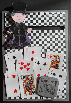
Catherine took George out to London last night for his birthday. She purchased tickets for them to see Darren Brown. So she wanted me to make a card to pop the tickets into.


I had been meaning to try out the idea of making a spinner card for a while and so cut a
 magician character with the Cricut and the Paper Doll Dress Up cartridge. I used a Craft Creations large card bank.
The patterned paper is from Magnolia and was mounted onto some card to stiffen it. then a slot was cut through the two using the Word Window Punch from Stampin' Up. The character is mounted onto two pennies with some 3D foam pads in between and one of these coins lays either side of the slot. The whole thing is then mounted onto the card blank with more 3D foam to hold it away from the card a little. Then hey presto, it spins!


I then added some miniature playing card from a Christmas cracker set. The greeting is a stamp from a Stampin' Up hostess set of birthday greetings.
So happy birthday George and I hope you both had a lovely evening at the theater. Hope you like the card too.
Lynn xxx

Sunday, 5 August 2012

Snail Trail

My daughter Emily has made some tiny snails. She designed a pattern and with ordinary sewing thread and a very fine crochet hook she made these little creatures.


They are shown here on some crochet cacti made a few years ago.


If you are interested in buying or making these snails, please see Emily's (Rusticwriter) Etsy store for snails or pattern.

Thursday, 2 August 2012

Olympic torch Take II

I was amazingly lucky to have another chance to hold the Olympic Torch. It came to work earlier this week with the young boy who took part in the relay a few weeks ago. He brought it along for other patients, parents and staff to see.


We had one of our regular Chyps Family Drop in Sessions which we hold every week of the school holidays. This week the theme was the Olympics. We also had a visit from the Fire Brigade. Here are a few photos, (although I can't share pictures of the children.)

Kay, Mandy, Tracie, me and Sharon.


Please see the Chyps web site and facebook for more photos and information.

Wednesday, 1 August 2012

Eliza Sharp


This formidable looking character is called Eliza Sharp and she is a distant relative born in 1836. I discovered her through my family tree research via Genes Reunited and was sent this photograph.
I decided to make a layout with the photo as my page for the Scrapology Design Team this month.

We are scraplifting this delightful layout by 2Dogs


I used Webster's Pages - Everyday Poetry collection - die cut, Glorious Day and Little Bird Told Me.


and a piece of brown lace trim from the same collection

And this is what I did:
With the die cut paper and Douglas Fir Bazzill, I cut and added strips of cardstock around the edges and trimmed them with scallop edge scissors.  
I cut images from patterned papers, choosing all the cages, 2 butterflies, the bird, blossom branch and the butterfly chart.
From the rest of the Little Bird paper I cut 2 circles – 4” and 5”. Then I cut 2 more circles from Scout Card about 1.5” bigger than the others. I used a Martha Stewart corner punch to decorate the Scout circles, creating a lacy edge.  
I inked the circles and mounted paper circles onto card circles then placed them on to the layout where required. I mounted the photo over larger circle.
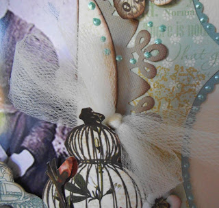
I stuck a 3” strip of lace to the top left corner and ‘hung’ a cage from it – using 3D foam pads to attach to the layout. Then added the other cages to the bottom right of the layout. Then I arranged the other items to the page. 
For each net bow, I took a 12” piece of netting and tie in a bow and stick to the page with glue.I cut the lettering with Cricut and stuck to layout.

Finally I decorate the lettering and scalloped border with the mint green liquid pearls, adding little dots to create the effect of a pearl swirl over the top right of the photo and onto the layout.

some close up photos:


.


The second bow. 

For more information please go the the 'N is for Netting' post on the Scrapology Blog.
The challenge runs until 5th September.

Thanks for Looking
Lynn x